
Product Listing Optimisation: The Complete Guide
That single finding should reorder most teams' optimisation priorities: if more than half of shoppers look at pictures before they read a word of copy, a listing with a perfect title and a thin image gallery is optimised backwards. This guide walks through the anatomy of a high-performing listing in the order shoppers actually process it, with the platform-specific limits (Amazon, Google, Shopify) and usability research behind each recommendation.
Most "listing optimisation" advice treats the title as the starting point because it's the easiest element to write a checklist for — character counts, keyword placement, front-loading. That's not wrong, but it's optimising the second thing a shopper notices as if it were the first. The sections below follow the actual sequence: images, then title, then the scannable bullets, then the fuller description, with a technical checklist tying the whole thing together across channels.
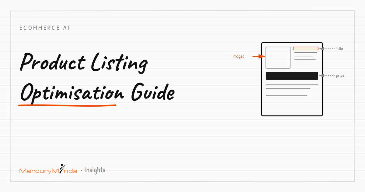
The anatomy of a high-performing listing
Images: what the research actually says
Baymard Institute's usability testing is the most rigorous published research on this specific question, and three findings should directly shape how a listing's gallery is built:
- Images come first, literally. In Baymard's product page usability testing, 56% of test subjects' first action on arriving at a new product page was exploring the images — before reading titles, descriptions, or scrolling further.
- At least one "in scale" image matters. 42% of users try to judge a product's physical size from its images, yet Baymard found 28% of sites fail to offer any image showing the product in scale (held in a hand, next to a common object, or in a real environment) — relying on shoppers to infer size from the description instead, which usability testing shows they often don't.
- Truncated galleries lose the majority of their content. When additional images beyond the first few are hidden behind a truncated thumbnail carousel with no clear indication more exist, Baymard found 50-80% of users never discover them at all — meaning a gallery of 10 images with poor truncation UX effectively performs like a gallery of 2 or 3.
The practical minimum from Baymard's product list and search result testing is 3 or more images to communicate sufficient visual information; there's no fixed research-backed maximum, but each additional image needs to earn its place by showing something the previous ones didn't — a different angle, a scale reference, a detail shot, or a real-use context — rather than a near-duplicate of the primary shot.
Image technical requirements by channel
| Requirement | Amazon | Google Shopping |
|---|---|---|
| Minimum resolution | 1000px on the longest side recommended (enables zoom) | 100×100px minimum; 800×800px+ recommended |
| Background | Pure white background required for main image | White or neutral background; no promotional text or watermarks |
| File formats | JPEG preferred; TIFF, PNG, GIF accepted | JPEG, PNG, GIF, BMP, TIFF |
| Non-compliant images | Listing suppression risk | Disapproval; one of the most common feed rejection causes |
Non-compliant imagery is a frequent, entirely avoidable cause of listing suppression on both channels — worth a dedicated check in any pre-publish process precisely because it's easy to overlook when a team is focused on the creative quality of a shot rather than its technical compliance.
Title structure and platform-specific limits
| Platform | Limit | Structural guidance |
|---|---|---|
| Amazon | 75 characters (all categories except media, enforced since July 27, 2026) | Front-load brand and the core product type; move secondary details to the new 125-character Item Highlights field, which is separately searchable |
| Google Merchant Center | 150 characters recommended; ~70 characters visible on mobile | Add distinguishing variant details (colour, size) that aren't captured elsewhere; avoid promotional language, which Google's guidelines explicitly discourage in titles |
| Shopify / own storefront | No hard platform limit; ~55-60 characters recommended for clean search snippet display | Write the canonical, information-dense title here, then generate channel-specific truncated or restructured versions from it rather than writing each independently |
Sources: Amazon Seller Central, title requirements announcement (effective July 27, 2026); Google Merchant Center Help, title and structured title documentation (support.google.com/merchants, accessed 2026).
The structural principle is the same across every channel even though the character budget differs: put the words a shopper needs to distinguish this exact product from every similar one as early as possible, because every channel truncates somewhere and the words that get cut are the ones near the end.
Bullet points and feature highlights
Bullet points do the job neither the title nor the full description can: they present the handful of scannable facts a shopper compares across a shortlist of similar products before committing to read anything longer. On Amazon specifically, both bullet points and the newer Item Highlights field are indexed and searchable — meaning bullet content affects discoverability, not just on-page persuasion.
A structure that works across most categories: lead with the single most decision-relevant spec or benefit, follow with supporting specs, include exactly what's in the box or included with purchase, and close with a use-case or compatibility note. Avoid restating the title verbatim in the first bullet — it wastes the scannable real estate on information the shopper already has.
Writing the full description
By the time a shopper reaches the full description, they've already seen the images and scanned the bullets — the description's job is to answer the specific objections and questions those earlier elements couldn't, not to repeat them in paragraph form. Three things a good description does that bullets can't:
- Handles genuine buying hesitations. Sizing uncertainty, care instructions, compatibility with other products, or how a material performs over time — the questions a shopper would ask a salesperson if one were standing there.
- Provides the depth structured data and AI shopping assistants need. A thorough, attribute-rich description feeds the schema.org Product markup that both traditional search and AI answer engines read to understand and represent the product accurately — thin descriptions produce thin structured data regardless of how good the markup implementation itself is.
- Establishes context bullets are too terse for. Why a specific material or construction choice matters, how the product compares to a simpler alternative, or what makes it suited to a particular use case — the kind of explanation that supports a purchase decision without being sales-pitch filler.
A description that just restates the bullets in sentence form, or pads length without adding new information, wastes the one part of the listing built for depth. If bullets already covered the facts, the description's job is explanation, not repetition.
Measuring whether optimisation is actually working
Two metrics matter more than "does this look better": conversion rate on the specific listing before and after a change, and — for marketplace listings — click-through rate from search results, since a title or primary image change can move discoverability before it ever affects on-page conversion. Change one variable at a time where the platform allows it (a new primary image, a restructured title) rather than relaunching the whole listing at once, or a lift in performance can't be attributed to the specific change that caused it.
For catalogs too large to manually review listing-by-listing, the pre-publish checklist below functions as a proxy: a listing that passes every check is statistically far more likely to perform well than one that fails several, even without A/B testing every individual SKU. Reserve direct performance testing for genuinely high-volume or high-margin listings where the sample size justifies it, and let the checklist carry the long tail.
Optimising across variants, not just one listing
Most of the guidance above assumes a single listing, but most catalogs are built from variant families — the same product in multiple colours, sizes, or configurations — and optimising each variant in isolation creates its own problems. A gallery that's excellent on the parent listing but missing entirely on child variants leaves shoppers who land directly on a specific colour with a worse experience than those who arrive at the main listing first. Titles that differentiate variants only by a single swapped word ("Blue" vs "Red") without varying anything else read as templated to both shoppers and search engines, echoing the same near-duplicate-content risk covered in our guide to automating product descriptions.
The practical fix is treating the parent listing's optimisation work — the checklist below, the image standards, the bullet structure — as a template genuinely applied to every variant, not a one-time effort on whichever variant happened to be built first. A variant family is only as strong as its weakest individual listing, since that's the one a shopper actually lands on when a specific size or colour ranks for their search.
A pre-publish listing checklist
| Element | Check |
|---|---|
| Title | Front-loaded with distinguishing details; within the target channel's current character limit |
| Primary image | Clean background per channel requirements; product fills frame appropriately |
| Gallery | 3+ images minimum; at least one "in scale" shot; thumbnails visible and not silently truncated |
| Bullets | Lead with the most decision-relevant fact; no verbatim repetition of the title |
| Description | Expands on bullets rather than repeating them; answers likely objections (fit, care, compatibility) |
| Identifiers | GTIN/UPC present and validated where applicable; consistent across all channels |
| Structured data | Schema.org Product markup populated from the same source record as the visible content |
This checklist is deliberately ordered to match how a shopper — and, increasingly, an AI shopping assistant reading structured data — actually processes a listing: visual first, then the scannable facts, then the deeper content, with the technical/identifier layer underneath all of it holding the whole thing together across channels.
When not to over-optimise
Two failure modes sit on the other side of good optimisation. Keyword-stuffed titles are the first: ordering distinguishing words correctly is not the same as cramming every plausible search term into a title until it reads like a spec sheet rather than a name a customer would recognise — Google's own guidelines explicitly discourage this, and it damages trust even where it doesn't trigger a policy violation. Image galleries padded with filler to hit a target count are the second: they dilute the genuinely useful shots (scale, detail, in-use) among near-duplicates, working against the exact usability findings this guide is built on. Optimisation means every element earns its place, not that more of everything is automatically better.
We audit and rebuild product listings against usability research and current channel requirements — images, titles, bullets, and the structured data underneath. Talk to a team that's done this for 17+ years.
Talk to the Team →Frequently asked questions
What is product listing optimisation?
Product listing optimisation is the practice of improving every element of a product page — title, images, bullet points, description, and structured data — so it converts more browsers into buyers and ranks well on search and marketplace channels.
How many images should a product listing have?
Baymard Institute's usability research found that 3 or more images are generally needed to communicate sufficient visual information, and that truncating additional images in a gallery causes 50-80% of users to overlook them entirely. There's no universal maximum, but each additional image should show genuinely new information (scale, detail, angle, in-use context), not a near-duplicate shot.
What's the ideal product title length?
It depends on the channel: Amazon requires 75 characters or fewer as of July 2026, Google Merchant Center recommends staying under 150 characters with only about 70 visible on mobile, and Shopify has no hard platform limit but benefits from a similar front-loaded, roughly 55-60 character structure for clean search snippet display.
Do bullet points actually affect conversion?
Bullet points structure the scannable, decision-relevant details (key specs, use cases, what's included) that shoppers look for after images but before committing to read a full description. On Amazon specifically, bullet points and the newer Item Highlights field are indexed and searchable, meaning they affect both discoverability and on-page conversion.